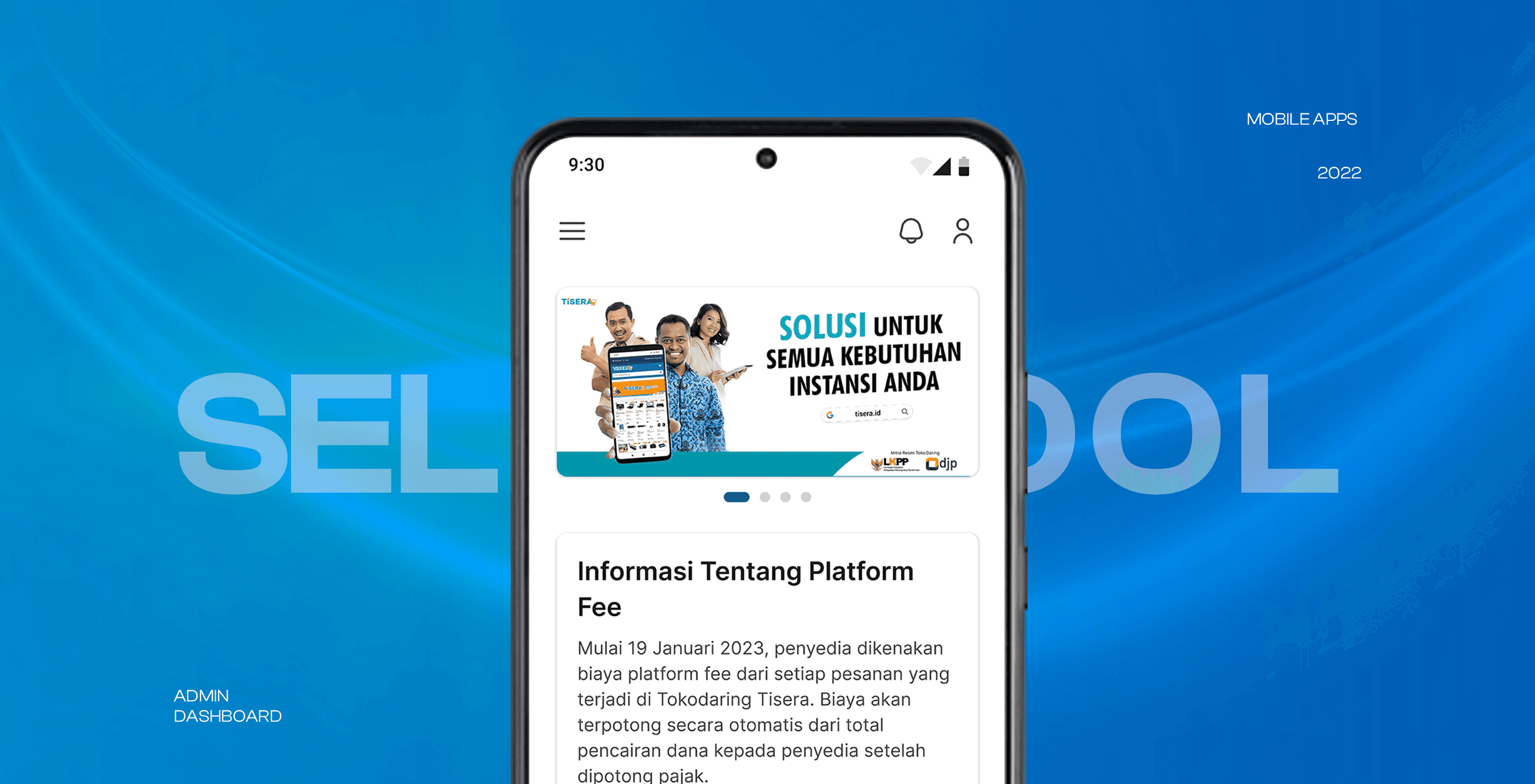
Admin Dashboard
Seller Tool
Tokodaring
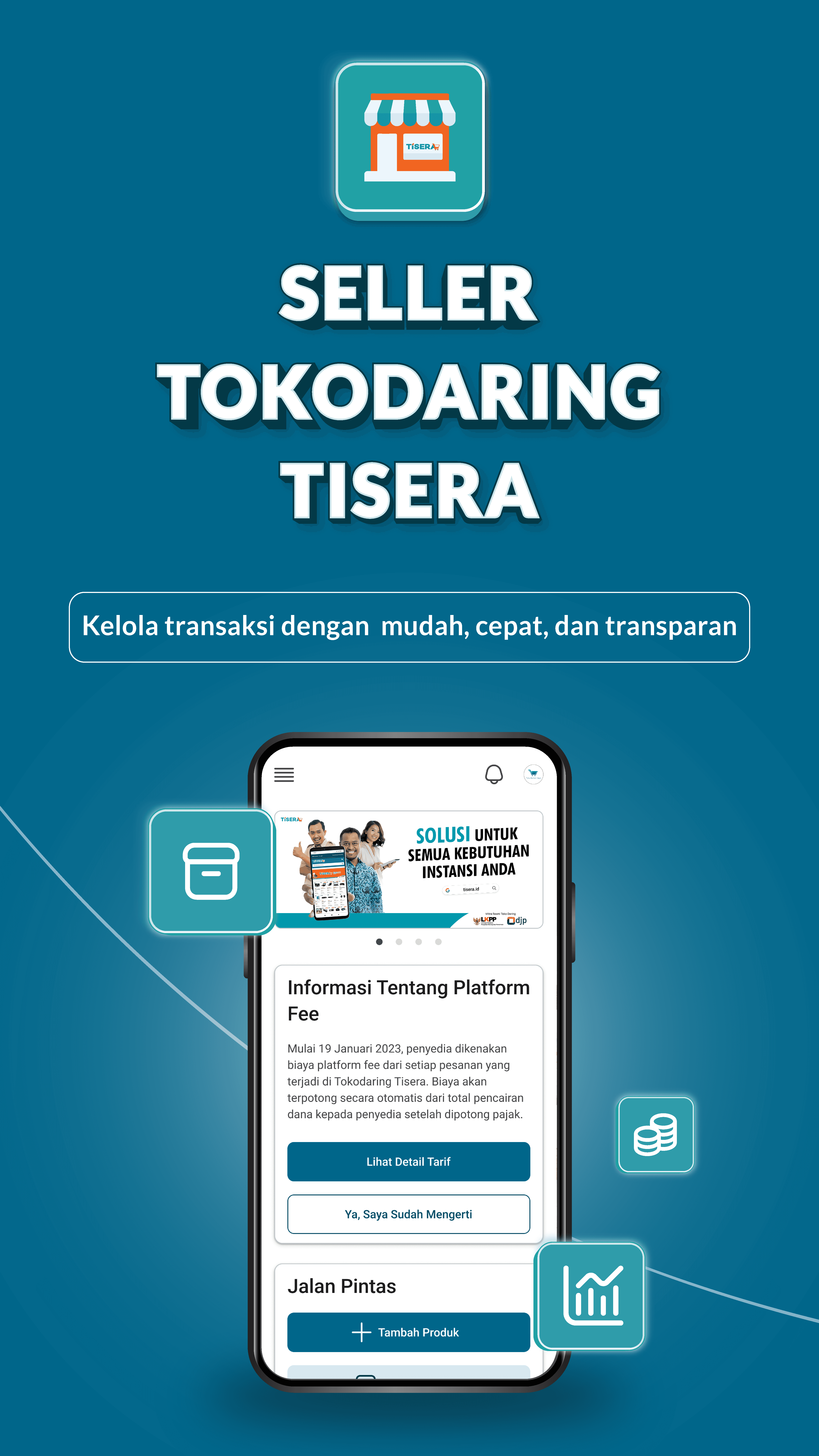
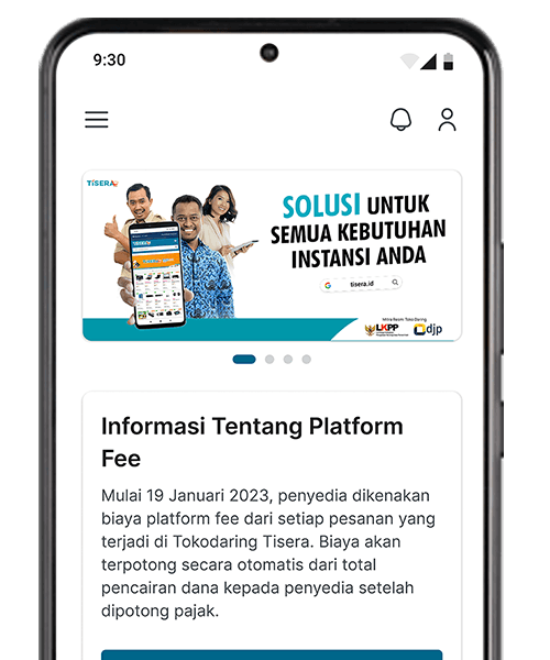
Tokodaring is a prominent e-commerce platform specializing in supplying school essentials for educational organizations. With a thriving web-based admin dashboard, the client recognized the need to enhance user accessibility and convenience. They initiated a project to develop a mobile version of the admin dashboard, extending essential features and functionalities from the desktop version to mobile devices. This mobile app will provide administrators with on-the-go access to essential tools and data, enhancing their convenience and efficiency while ensuring a seamless user experience.
Year
2023
Role
UI Designer
Platform
Mobile App
Project Goals
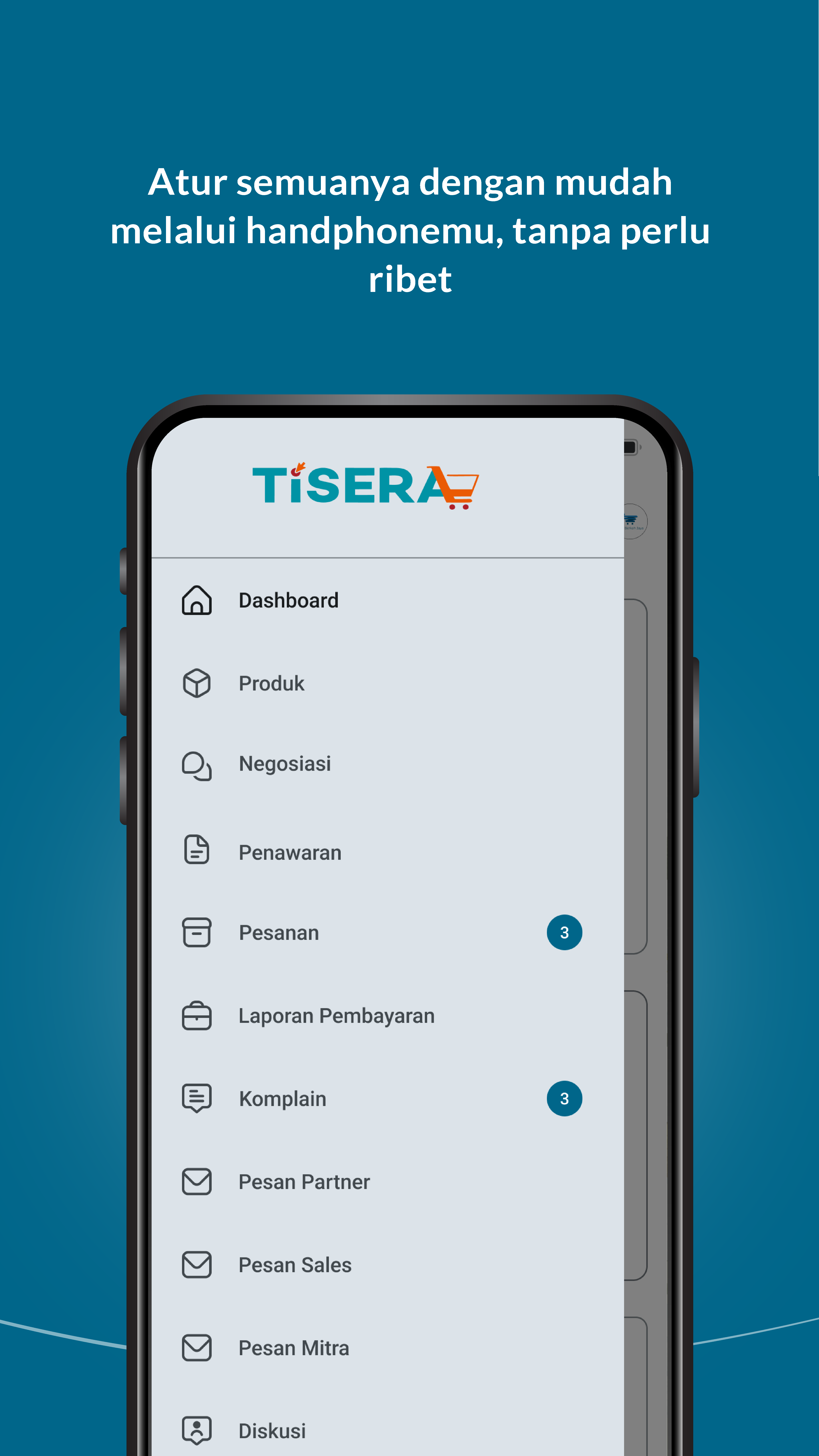
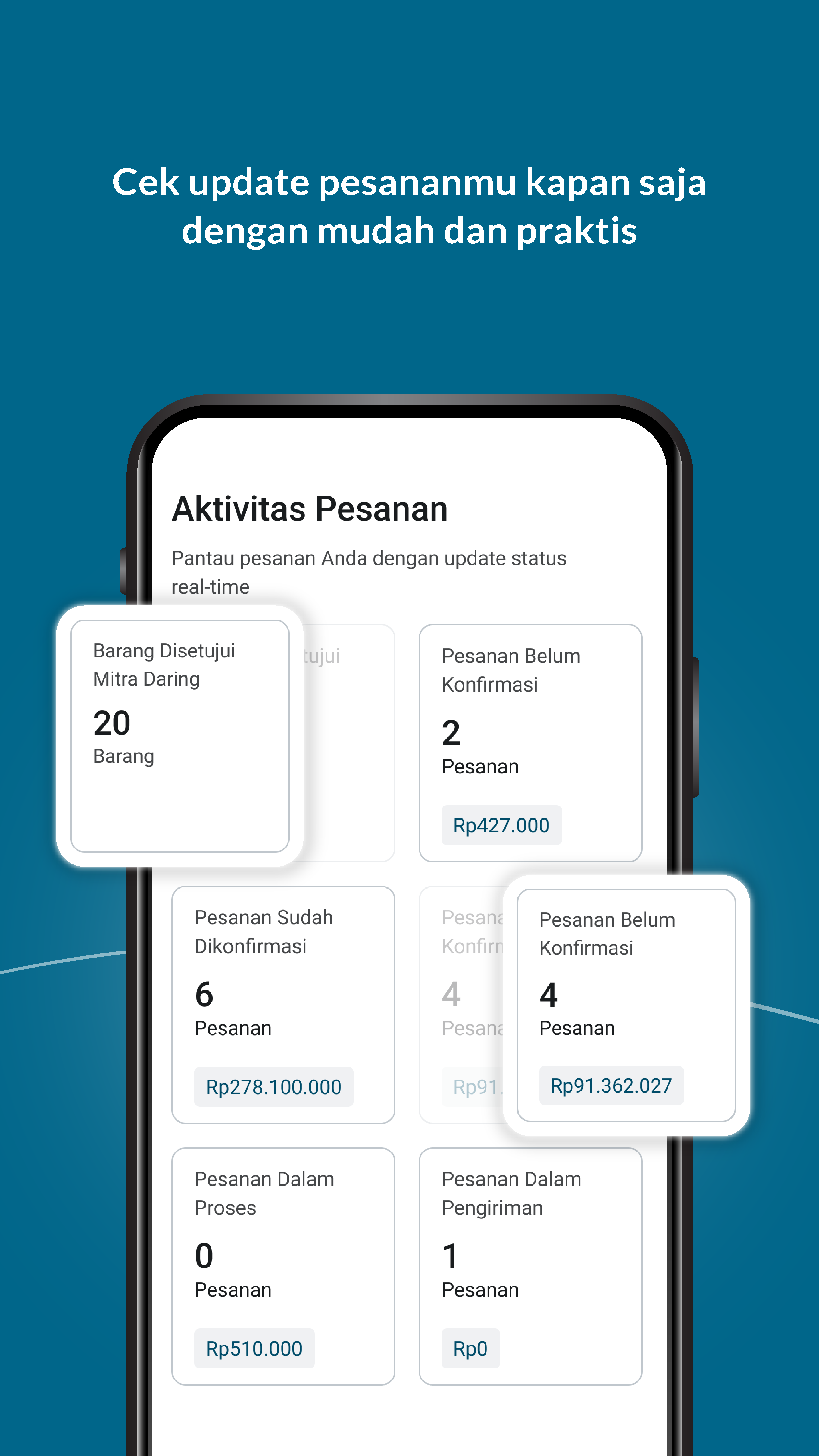
Develop a mobile version of the admin dashboard to provide users with on-the-go access to essential features.
/ 1 / Understanding Client Brief and Learning from Desktop Version
1
Receive the project brief from the client, outlining the need for a mobile version.
Collect Data from Desktop Version
Study the existing desktop version of the admin dashboard to understand its flow, structure, and functionality. To achieve this, we employed a systematic approach that involved visual representation. I meticulously created individual sticky notes, each dedicated to a specific feature or functionality encountered during our analysis.
Penawaran
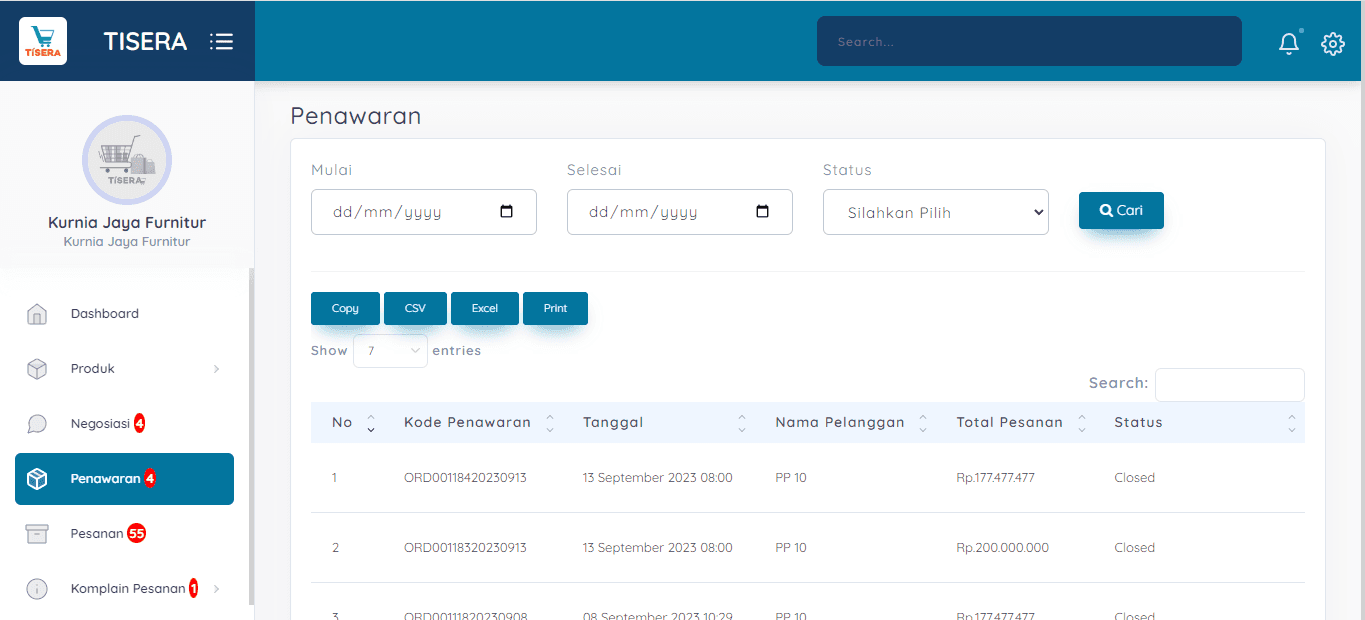
Penawaran
Data yang masuk di table penawaran adalah belanja dengan total lebih dari 50 juta. Proses penawaran : Checkout barang seharga 50 juta --> Buat Perbandingan --> Klik Penyedia --> Klik Penawaran
Fitur
Tabel pesanan yang melakukan penawaran
Filter tanggal
Filter status pesanan
Pencarian pesanan berdasarkan kode transaksi / nama pembeli
Pesanan
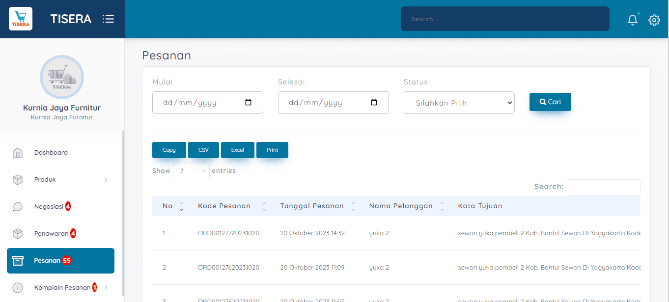
Pesanan
Berisi data pesanan yang masuk ke penyedia
Fitur
Tabel pesanan yang melakukan penawaran
Filter tanggal
Filter status pesanan
Pencarian pesanan berdasarkan kode transaksi / nama pembeli
/ 2 / Information Archiitrcture
Information Architecture

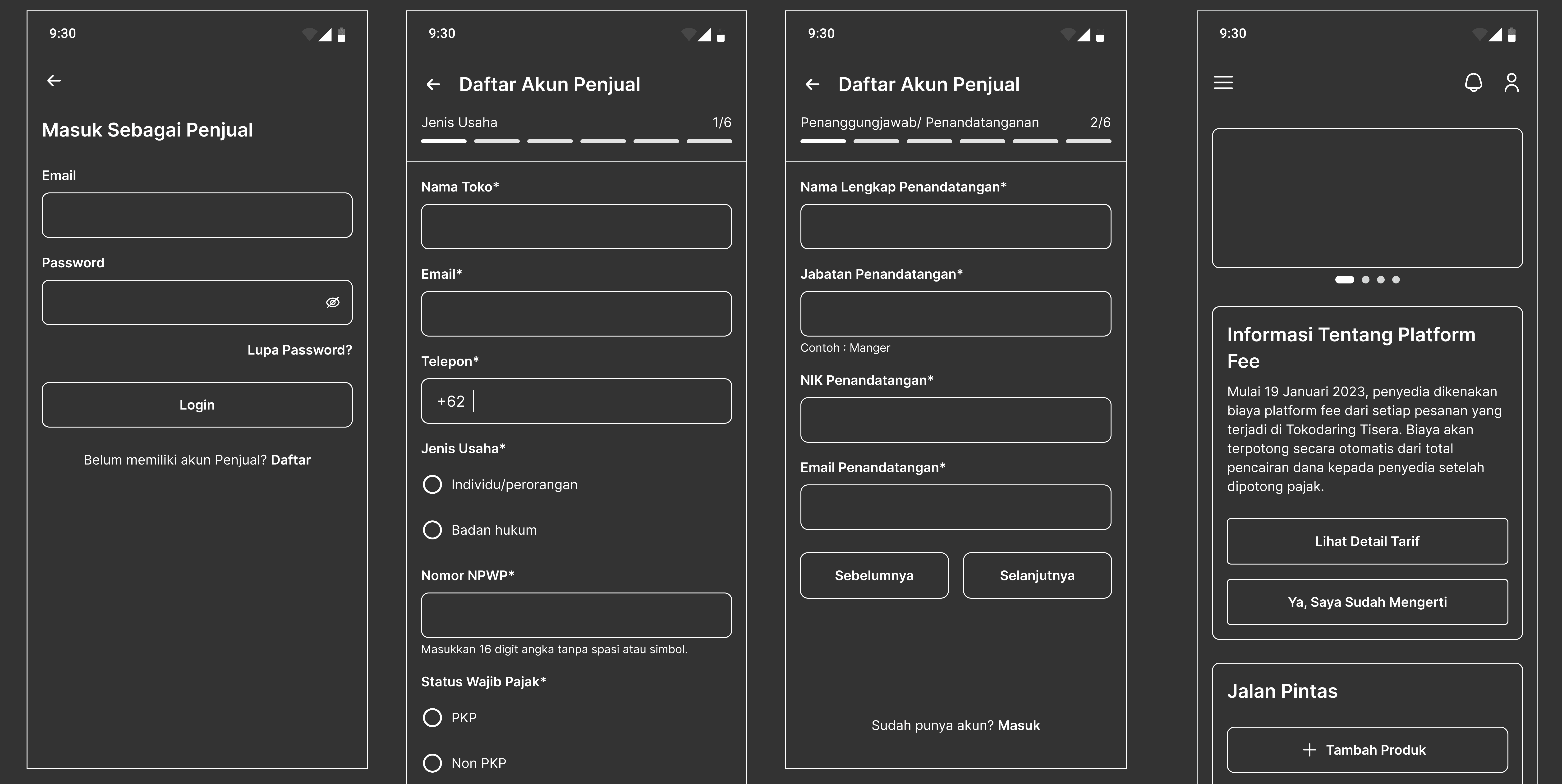
/ 3 / Wireframe
Wireframe
/ 4 / Presentation
Stakeholder Presentation and feedback from QA
The UI/UX design process for Bike Aja emphasized competitor analysis and feature ideation, focusing on creating a dedicated biking community, enabling event management, providing resources, offering a personalized feed, and ensuring privacy controls. The design approach aimed to cater to the unique needs and preferences of the biking community.
The next steps in this project would involve development and implementation, followed by user testing and continuous improvement based on user feedback.
/5/ Design
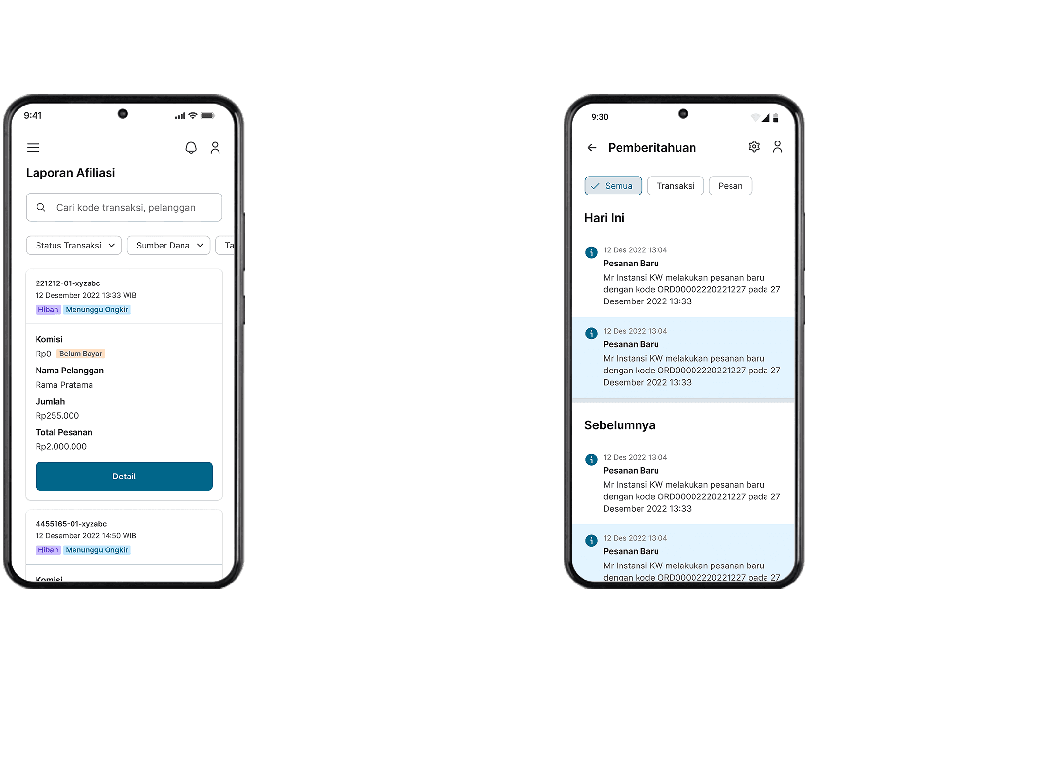
Design UI
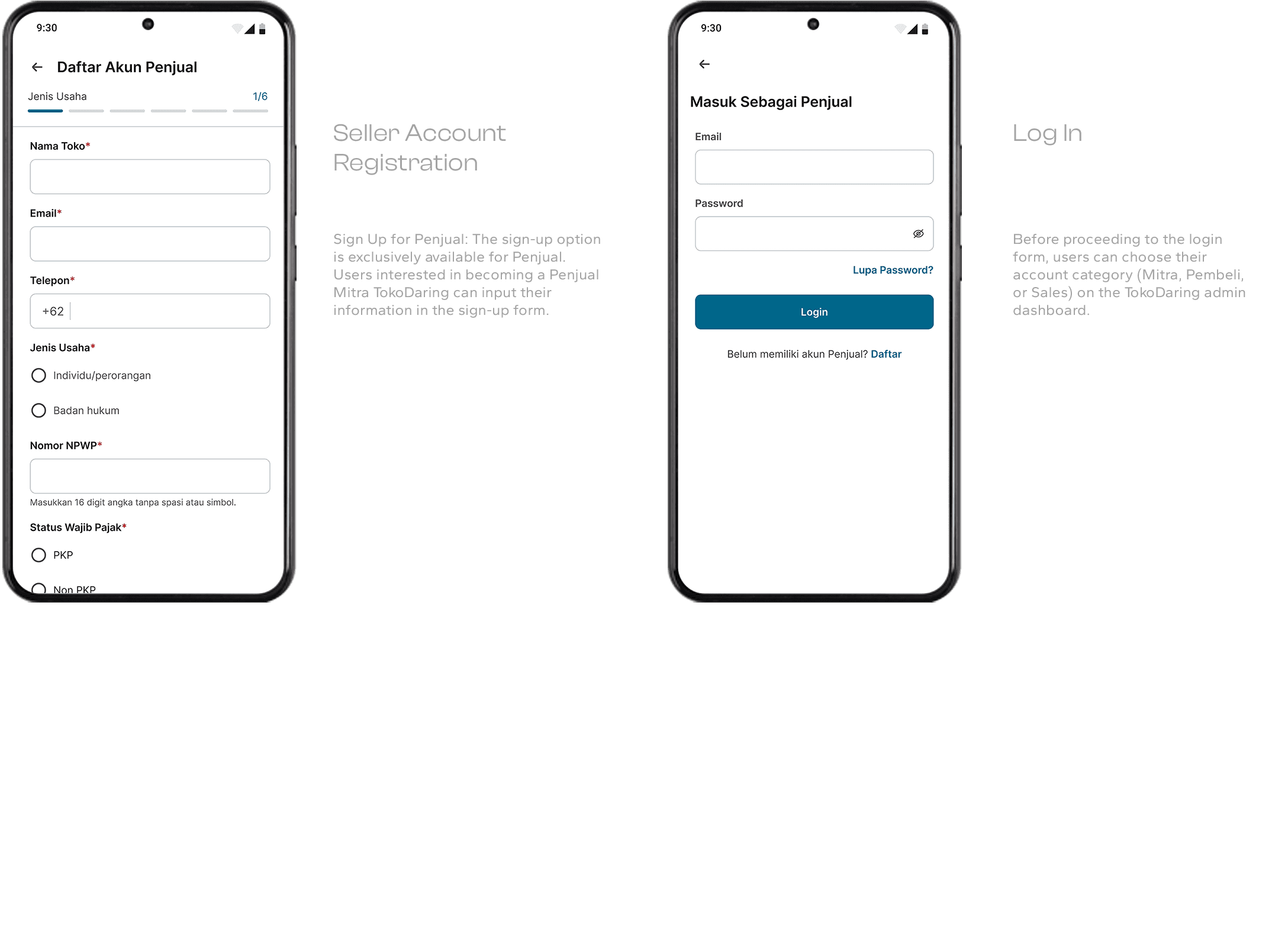
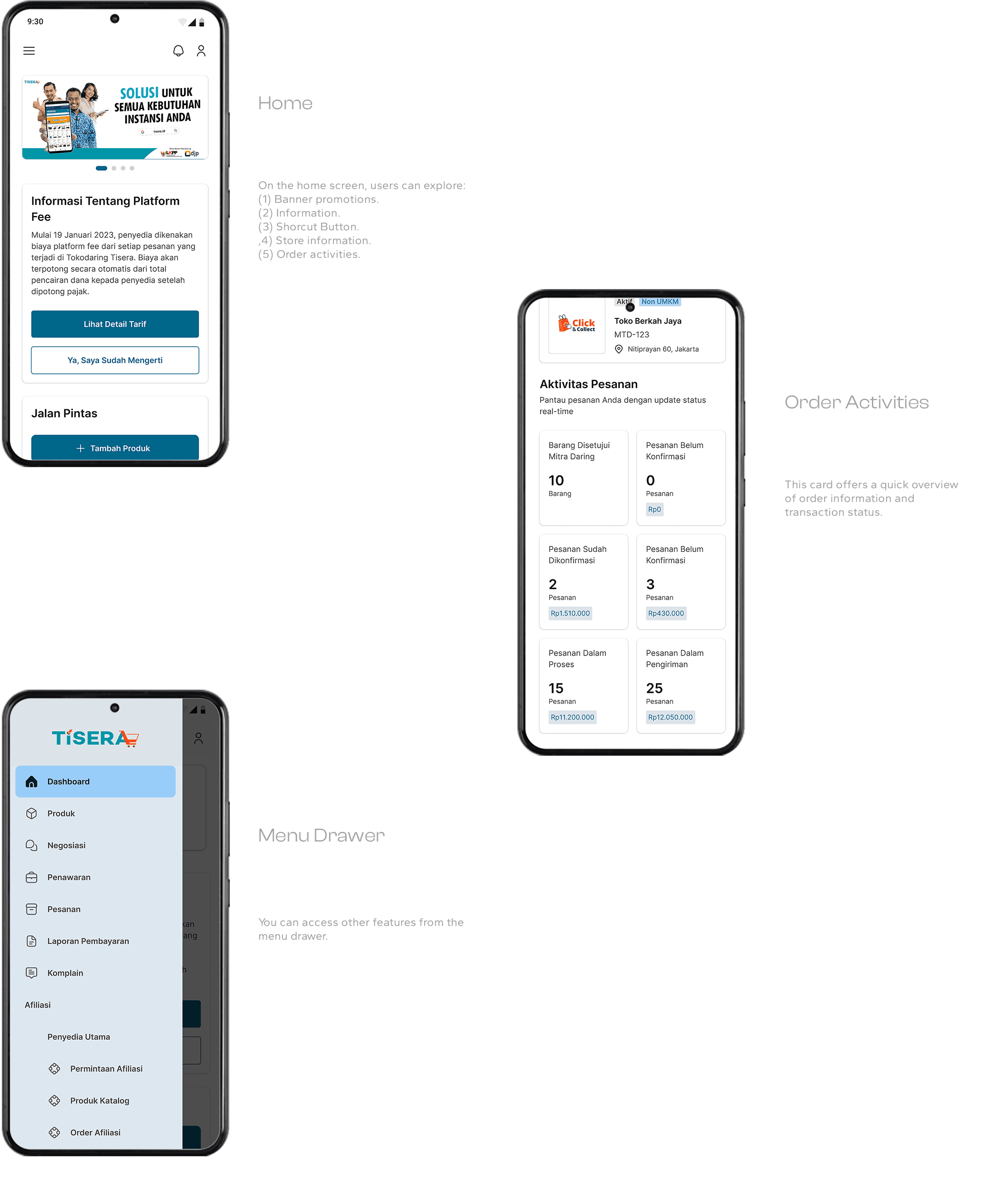
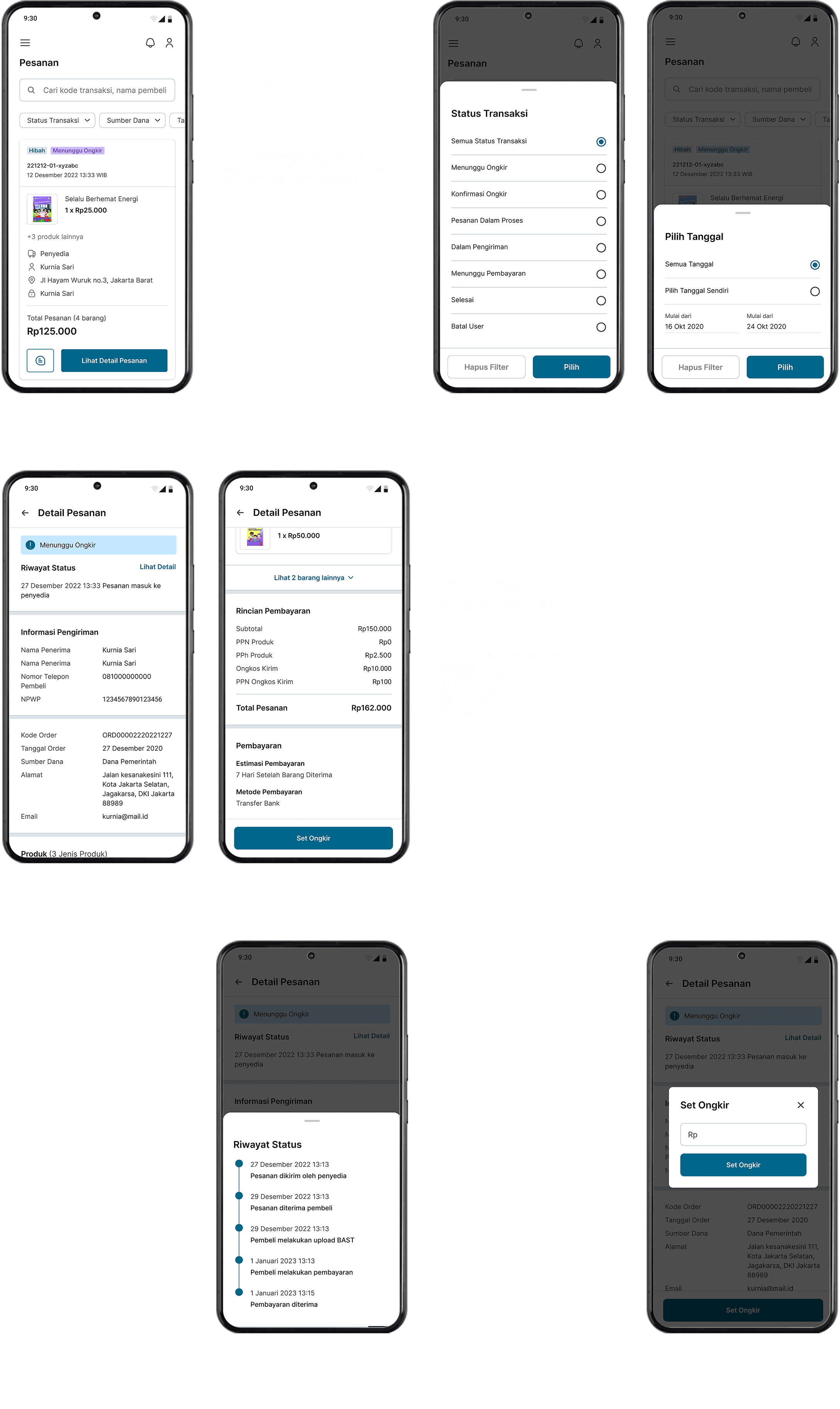
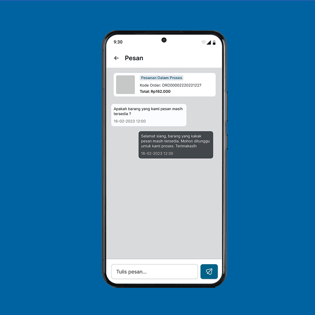
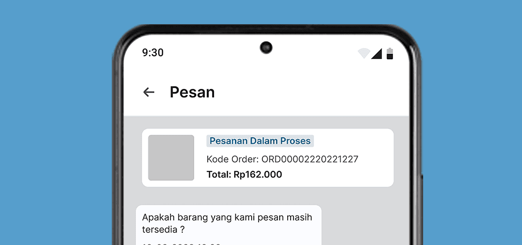
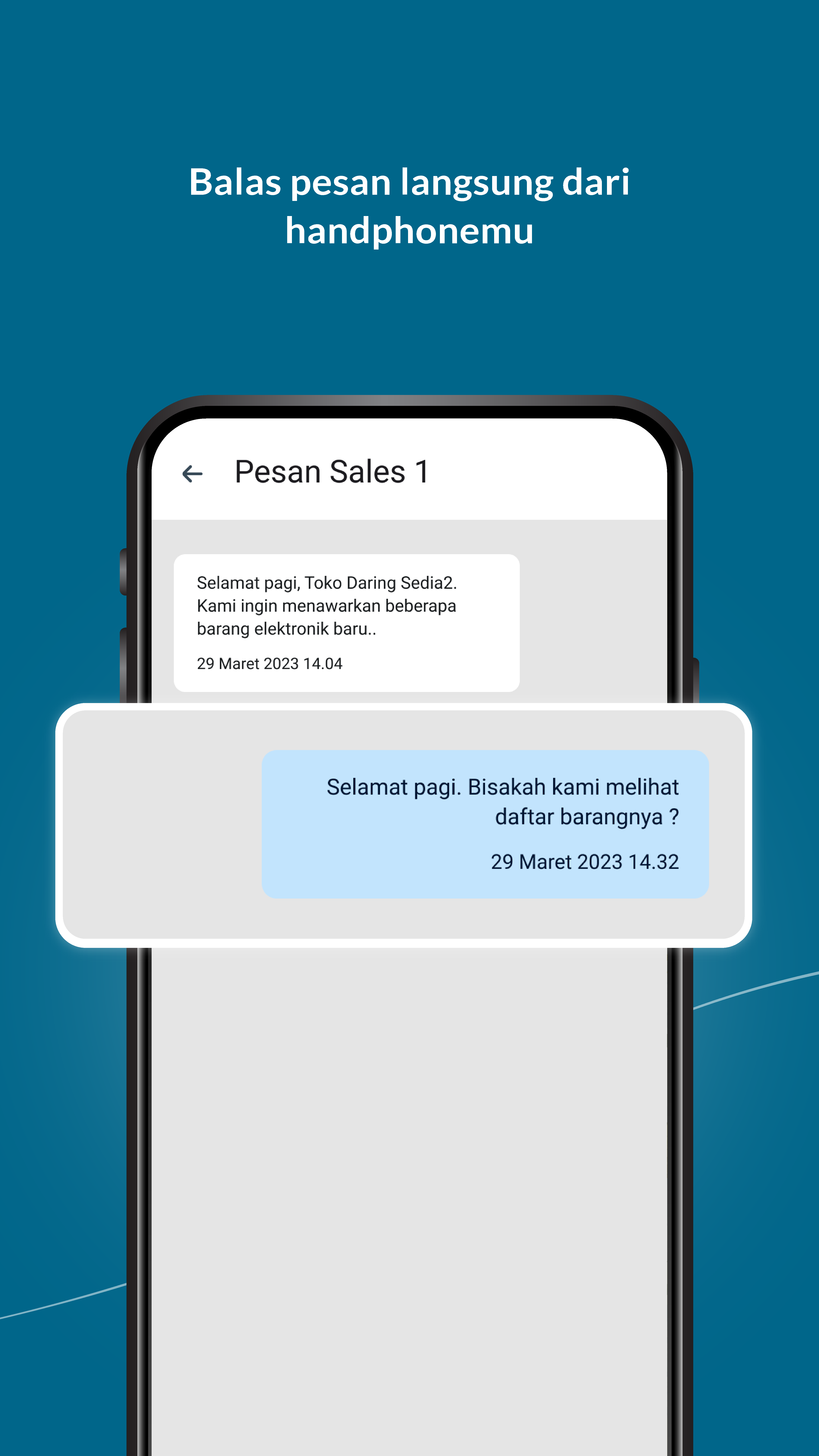
Message
User can engage in discussions with customers, sales, and partners through chat.
UI KIT
UI KIT / TYPOGRAPHY
INTER
WHERE AS A COMMON UNDERSTANDING OF THESE RIGHTS AND FREEDOMS IS
Everyone has the right to an effective remedy by the competent national tribunals for acts violating the fundamental rights granted him by the constitution or by law.
H1
Inter - Semi Bold - 24pt
H2
Inter - Semi Bold - 20pt
H3
Inter - Semi Bold - 16pt
H4
Inter - Semi Bold - 14pt
Paragraph 1
Inter - Regular - 16pt
Paragraph 2
Inter - Regular - 14pt
Button
Inter - Semi Bold - 14pt
UI KIT / COLOR
HEX #FFFFFF
HEX #00668A
HEX #00668A
HEX #1C1B1E
HEX #303034
HEX #6D6F72
HEX #6D6F72
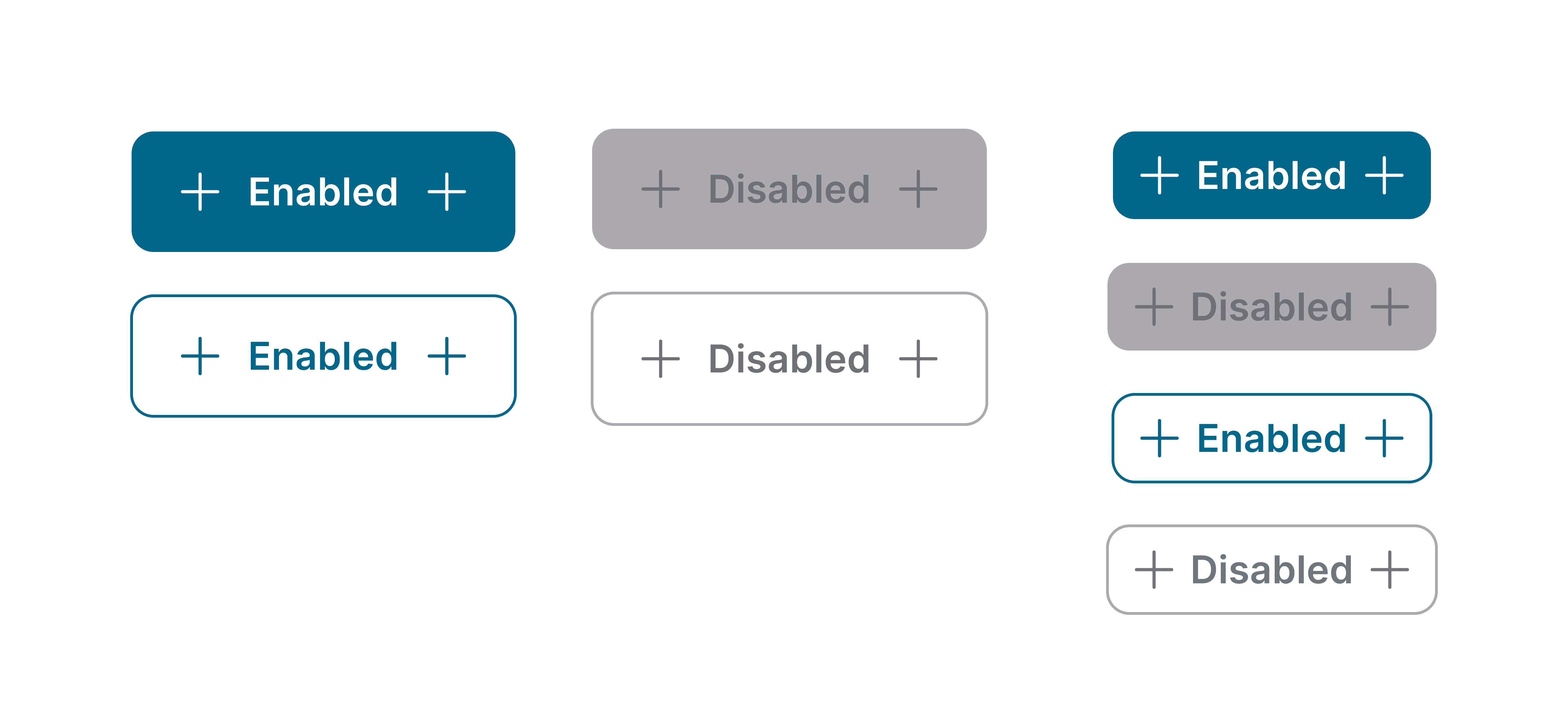
UI KIT / ICON & BUTTON

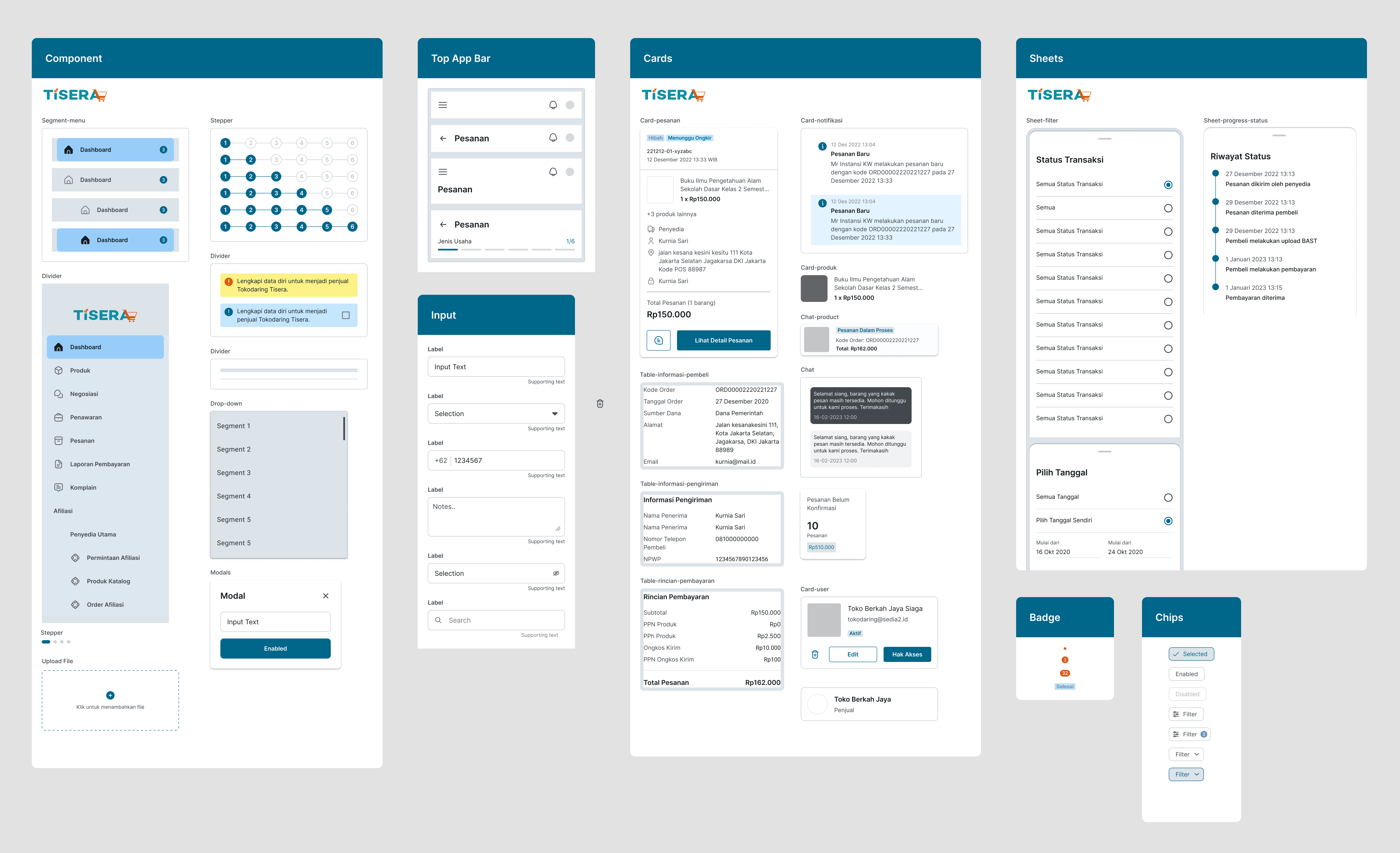
UI KIT / COMPONENT
Key Takeaways
Client Collaboration
Actively involving the client throughout the project lifecycle was crucial. Regular presentations and feedback sessions helped ensure that the mobile app design aligned with the client's vision and requirements.
QA Team Involvement
Early collaboration with the Quality Assurance (QA) team proved invaluable. Their input and testing helped identify potential issues and allowed for proactive problem-solving.
Documentation
Documenting project details, especially in large-scale projects, is essential for maintaining consistency and facilitating knowledge transfer. It helps ensure that everyone involved in the project is on the same page.
Challenges in Mobile Adaptation
Adapting a desktop flow to mobile screens can be challenging, particularly without usability testing. It's important to consider the limitations of screen space and user interaction on mobile devices and make design decisions accordingly.
Thankyou for Reading
If you have any questions or if you'd like to collaborate, feel free to contact me.
Designer based in Indonesia
© 2023 Asyah Puspitasari